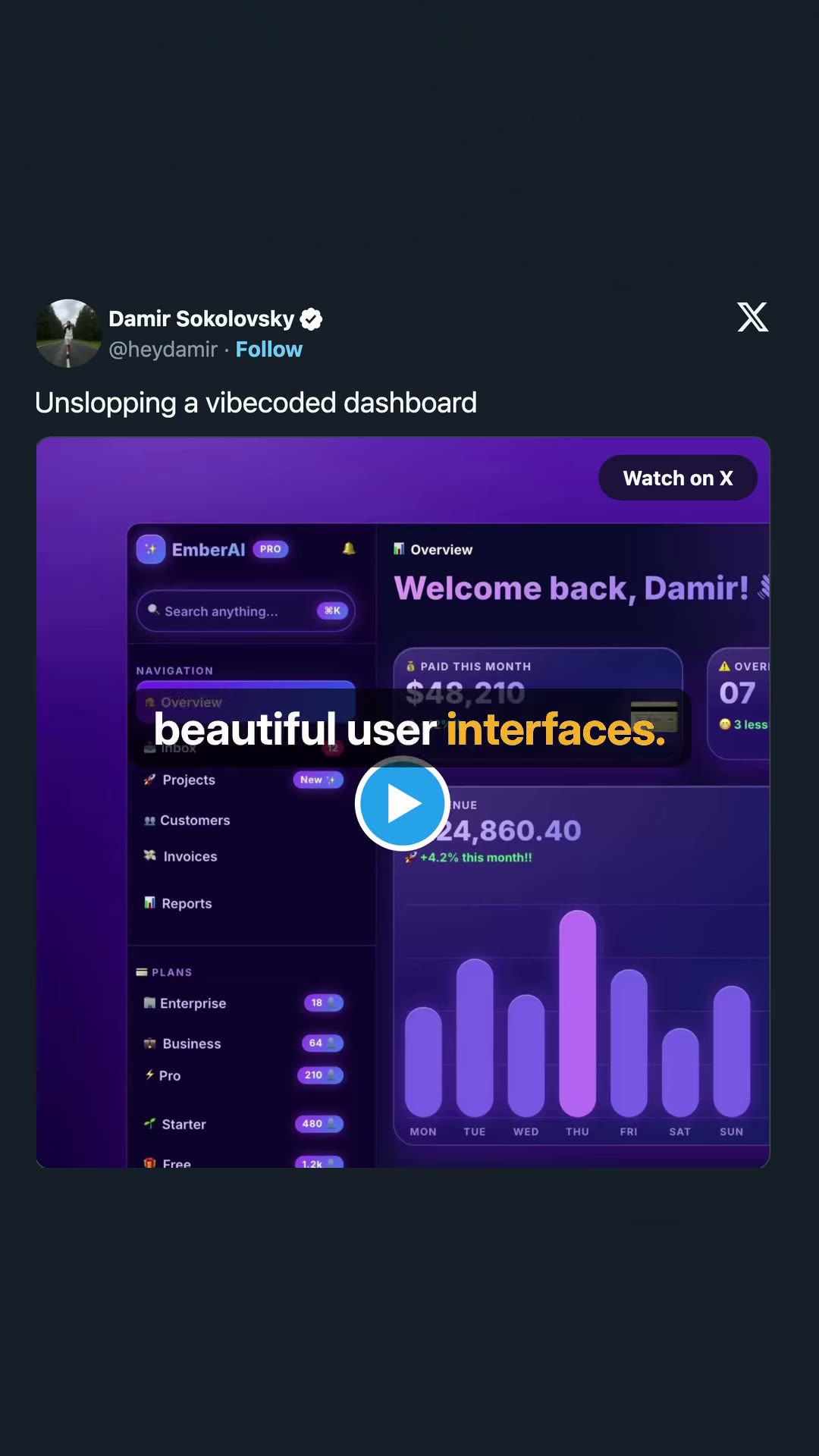


A designer explains a trend of turning AI-generated "slop" dashboard designs into polished, senior-level UI using AI tools like Claude Code.
AI slop vs. senior designer
Damir Sokolovsky @heydamir Unslopping a vibecoded dashboard Watch on X EmberAI PRO Search anything... NAVIGATION Overview Inbox Projects New Customers Invoices Reports PLANS Enterprise 18 Business 64 Pro 210 Starter 480 Free 1.2k Overview Welcome back, Damir! PAID THIS MONTH $48,210 OVER... 07 3 less beautiful user interfaces. 24,860.40 +4.2% this month!! MON TUE WED THU FRI SAT SUN
0 senior designer made it.
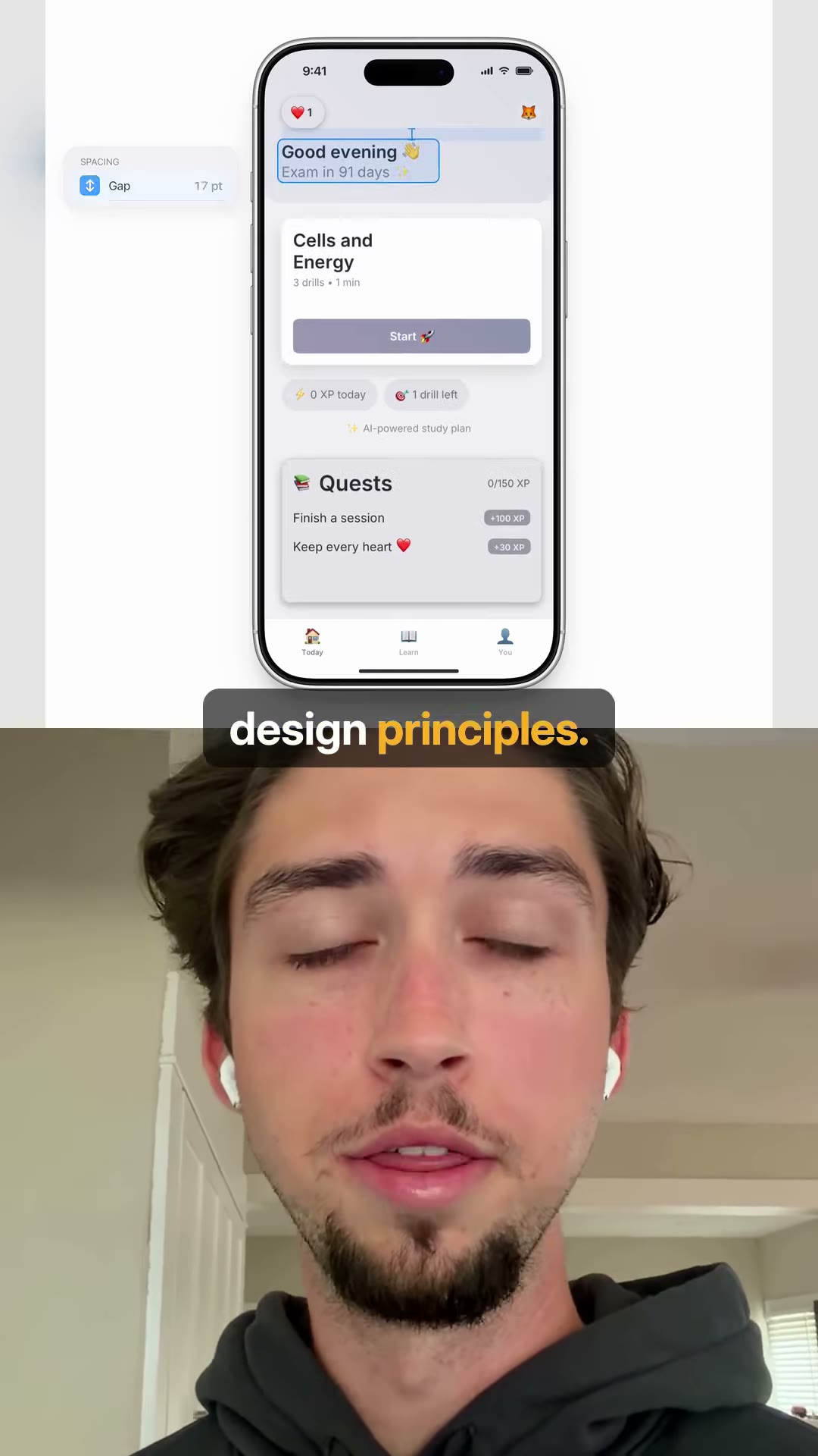
SPACING Gap 17 pt 9:41 1 Good evening Exam in 91 days Cells and Energy 3 drills • 1 min Start 0 XP today 1 drill left AI-powered study plan Quests 0/150 XP Finish a session +100 XP Keep every heart +30 XP Today Learn You design principles.
and more.
There's a trend where designers are showing before and afters of AI Slop turned into beautiful user interfaces. This trend started when Demir Sokolowski posted this video on X, where he showed the exact steps of turning a Slop dashboard design into a modern UI that looks like a senior designer made it. It's a mast over one million views by curious designers trying to figure out how to get better design output from AI's like Cloud Code, and he said he's going to release a skill that packages his design principles. Other designers have also posted similar before and afters of mobile app designs, web designs, and more. I post videos all about getting better AI design output, so follow me if you want to learn more.
scraped.media
derived.classifier
derived.classifier
scraped.caption
derived.classifier
derived.classifier
user.note
derived.audio_transcript
derived.keyframe_ocr
$0.0358
classify $0.0075on-screen-text $0.0283